
How to create statistical plots using the VegaLite.jl package
This is the second of several articles where I compare different Julia graphics packages for creating statistical plots. I've started with the Gadfly package (Statistical Plotting with Julia: Gadfly.jl, [SPJ02]) and continue the series here with the VegaLite package.
In the introduction to the series (The Grammar of Graphics or how to do ggplot-style plotting in Julia, [SPJ01]), I've explained the Grammar of Graphics (GoG) which is the conceptual base for these graphics packages. There I've also introduced the data which will be used for the plotting examples.
The objective of this article (and the ones which will follow in the series) is to reproduce the visualizations from [SPJ02] using the exact same data, but each time of course with another graphics package in order to achieve a 1:1 comparison of all packages.
Therefore the descriptions of these visualizations in the following text will be identical to the ones in [SPJ02]. I.e. this article is self-contained (you can read and understand it, without having read [SPJ02]). It has also the same structure (headlines etc.) like [SPJ02], so that it easy to make a side-by-side comparison.
VegaLite
VegaLite.jl is (like Gadfly.jl) a very complete implementation of the Grammar of Graphics (GoG). It has been written by a group led by Prof. David Anthoff (University of Berkeley) consisting of more than 20 contributors. VegaLite is part of a larger ecosystem of data science packages (called Queryverse) which includes query languages (Query.jl), tools for file IO and UI Tools (ElectronDisplay.jl).
Technically VegaLite takes quite a different approach: Whereas Gadfly is completely written in Julia, VegaLite is more like a language interface for the Vega-Lite graphics package (note the dash in its name in contrast to VegaLite, which denotes the Julia package). Vega-Lite takes specifications of visualizations in JSON format as inputs which the Vega-Lite compiler transforms into the corresponding visualizations.
Vega-Lite is completely independent of the Julia ecosystem and apart from VegaLite there exist interfaces for other languages like JavaScript, Python, R or Scala (see "Vega-Lite Ecosystem" for a complete list).
As Vega-Lite uses JSON as its input format, these specifications have a rather declarative nature. VegaLite tries to mimic this format with the @vlplot-macro, which is the basis for all visualizations as we will see in the following examples. This makes it less Julian than e.g. Gadfly, but has on the other hand the advantage, that somebody who is familiar with Vega-Lite will easily learn how to use VegaLite. And if there is something missing in the VegaLite documentation it is often easy to find the corresponding part within the Vega-Lite docs.
A distinguishing feature of Vega-Lite (as well as VegaLite) is its interactivity. Its specifications may not only describe a visualization but also events, points of interest and rules about how to react to these events. But this feature is beyond the article at hand. For readers interested in this aspect, I recommend to have a look at the Vega-Lite home page or the paper "Vega-Lite: A Grammar of Interactive Graphics".
Example Plots
As in the preceding article, I will use for the comparison a few diagram types (or geometries as they are called by the GoG) which are commonly used in data science, namely:
- bar plots
- scatter plots
- histograms
- box plots
- violin plots
VegaLite offers of course many types more as you can see in this gallery. But in order to obtain a 1:1-comparison between all packages, I stuck with the types listed above.
The data for the examples is assumed to be ready in the DataFrames structures countries, subregions_cum and regions_cum presented in the introducing article [SPJ01] to the series.
Most plots are first presented in a basic version, using the defaults of the graphics package and get then refined using customized attributes (for labels, background color etc.).
Bar Plots
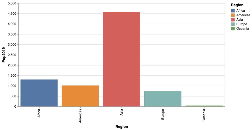
Population by Region
As in [SPJ02] we start with a simple bar chart, that shows population size (in 2019) by region. This is done using the following @vlplot-command mapping data to aesthetics and using a bar-geometry as we learned in the introducing article about the Grammar of Graphics. Julia’s pipeline syntax is used (|>) to specify the regions_cum -DataFrame as being the input to @vlplot.
regions_cum |>
    @vlplot(
         width = 600, height = 300,
         :bar,
         x = :Region, y = :Pop2019, color = :Region
     )
This results in the following bar chart:
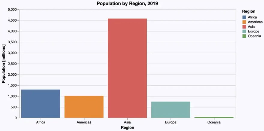
In a second version we don’t rely on defaults, but set axis labels, title and background color manually. Apart from that, we want the bar labels on the x-axis with a horizontal orientation for better readability. This leads to the following code, where title-attributes are used for the labels as well as the diagram title, an axis-attribute for changing the orientation of the bar labels and a config for general attributes like background color.
… creating the following beautified bar chart:
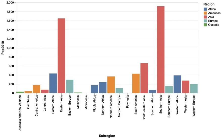
Population by Subregion
The next bar chart depicts population by subregion using the following @vlplot-command:
subregions_cum |>
    @vlplot(
        width = 600, height = 300,
        :bar,
        x = :Subregion, y = :Pop2019, color = :Region
    )
… resulting in the following bar chart:
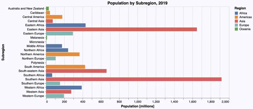
We can see that there is room for improvement: As there are quite a few subregions and their names a relatively long, a horizontal bar diagram might be more readable. Apart from this, we adapt again labels, title, background color etc. leading to the following code, where we switch to a horizontal layout just by flipping the data attributes for the x- and the y-axis:
… resulting indeed in a more readable bar chart:
It get’s even more readable, if we sort the subregions by population size before rendering the diagram. We could sort the subregions_cum-DataFrame using Julia (as we did in the Gadfly-example), but VegaLite offers the possibility to sort the data in the graphics engine using the sort-attribute.
If we apply this code we finally get:
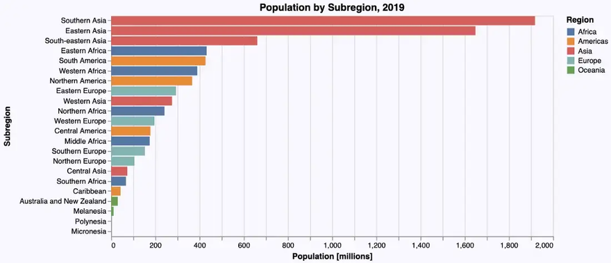
A word of caution at this point: While it is possible to sort data within the graphics engine I wouldn’t recommend it with larger data sets, because it is considerably slower than doing it directly using Julia.
Scatter Plots
In the next step we have a look at the population at the country level in relation to the growth rate. A scatter plot is a good way to visualize this relationship. We get one, using a point geometry as follows:
countries |>
    @vlplot(
        width = 600, height = 300,
        :point,
        x = :Pop2019, y = :PopChangePct, color = :Region
    )
… resulting in this scatter plot:
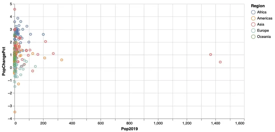
As we also mapped the region to the color aesthetics, we get a more differentiated picture involving region information in addition.
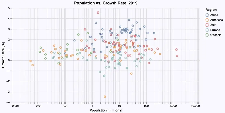
But the distribution of the data is quite skewed — most countries have a population below 200 Mio. So a logarithmic scale on the x-axis might give a better insight into the data. And again, we add some labels, background color etc. leading to the following code:
… giving us the following improved scatter plot:
Histograms
Bar plots and histograms have the same geometry (in the sense of the “Grammar of Graphics”). But in order to get categorical data on the x-axis, the data used for a histogram has to be mapped to (artificial) categories in a process called binning. In the GoG this is done using a so-called bin statistic.
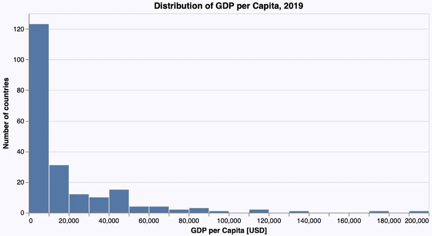
VegaLite follows the GoG strictly. So we get a histogram that shows the distribution of GDP per capita among the different countries with the following @vlplot-command using a bar geometry with the parameter bin set to true:
countries |>
    @vlplot(
        width = 600, height = 300,
        :bar,
        x = {:GDPperCapita, bin = true}, y = “count()”
    )
… resulting in this histogram:
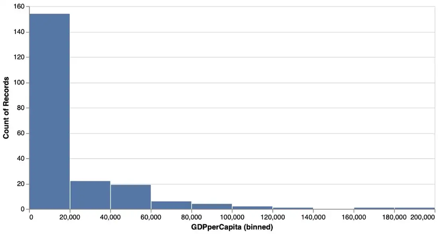
A reasonable bin size has been chosen by default (which wasn’t the case with Gadfly).
And again we can add labels etc. And in order to have exactly the same number of bins as in the Gadfly example, we set it explicitly to 20 using the following code:
… leading to the following improved histogram:
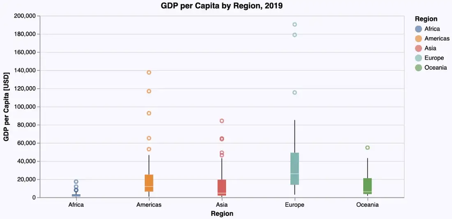
Box Plots and Violin Plots
To obtain an insight into the distribution of some numerical data, box plots or violin plots are typically used. Each of these diagram types has its specific virtues. So let’s visualize the distribution of the GDP per capita for each region using these plots.
Box Plot
Let’s immediately use the ‘beautified’ version based on a boxplot-geometry:
… giving us the following box plot:
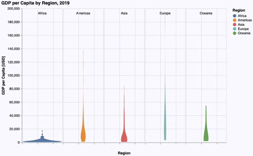
Violin Plot
As VegaLite doesn’t support violin plots as a geometry on its own, they have to be constructed using density plots (one for each region) which are lined up horizontally. This leads to the following, rather complicated specification:
The basic geometry used to create the density plots is an area geometry. The data is then grouped by region and for each group the density is computed. This is done using a transform-operation. Assigning the density to the x-axis results in vertical density plots. In the next step all five density plots are lined up horizontally using the column-attribute.
The width and spacing attributes in the last line define each column (i.e. each density plot) to have a width of 120 pixels horizontally and to leave no space between these plots.
So we finally get the following violin plot:
Zooming in
As in the Gadfly-examples we note, that the really interesting part of the distributions lies in the range from 0 to 100,000$. Therefore we want to restrict the plot to that range on the y-axis, doing sort of a zoom-in.
In the Gadfly example we restricted the values on the y-axis to this range to achieve the desired effect. Such a restriction can also be specified in VegaLite using scale = {domain = [0, 100000]}. Unfortunately this doesn’t give us the result we want: The diagram will be plotted in this range but the plots themselves still use the whole range up to 200,000$, thus getting partly plotted outside the diagram:
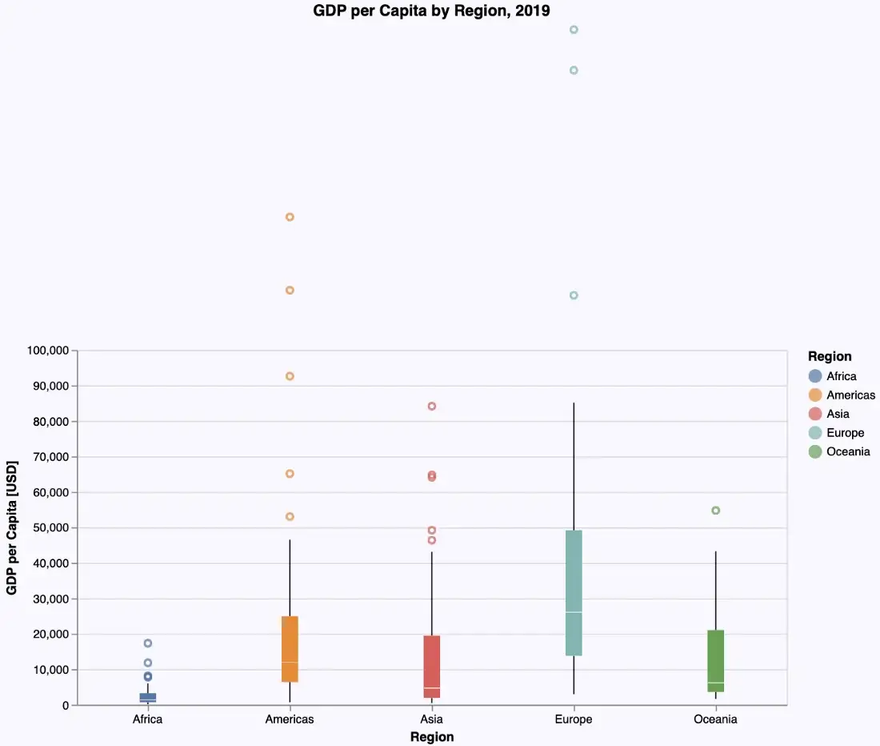
The only way to get a roughly similar result in VegaLite would be to restrict the data to values in that range up to 100,000$ using a filter expression. But be aware: this is conceptually something different, giving us not exactly the same plots as if we would do it on the whole dataset. So we don’t have a real solution for this visualization.
This may be just a problem of the VegaLite documentation, where I couldn’t find any other solution (or my fault for not doing enough research and e.g. using also the extensive documentation of Vega-Lite).
Conclusions
As we can see, VegaLite follows most of the time quite closely the concepts of the Grammar of Graphics (even more closely than Gadfly does). That’s one of the reasons why the plot specifications are so consistent (same things are always specified in the same way independent of context) und thus easy to learn and to memorize.
But as we can see with the violin plot, if things are not predefined, the specifications can become quite complex. Together with the rather non-Julian syntax which needs some time to learn and to get used to, I wouldn’t recommend VegaLite to occasional users. It needs some learning and training. But if you invest that time and effort, you get a really powerful (and interactive) visualization tool.
An interesting add-on to VegaLite, which I would like to mention, is the interactive data explorer Voyager (see: DataVoyager.jl). It’s an application that allows to load data and create a variety of visualizations without any programming.
If you want to try out the examples from above by yourself you can get a Pluto notebook which is sort of an executable variant of this article from my GitHub repository.

Top comments (1)
This was very helpful! It was driving me crazy that I couldn't figure out how to zoom in on the y-axis without filtering data and I think I found the solution. You have to set the mark clip attribute to true, ie
mark={:point, clip=true}vega lite scale documentation