
This article appeared in Towards Data Science on Aug 12th, 2022
Introduction to a comparison of Julia graphics packages for statistical plotting
The Grammar of Graphics (GoG) is a concept that has been developed by Leland Wilkinson (The Grammar of Graphics, Springer, 1999) and refined by Hadley Wickham (A Layered Grammar of Graphics, Journal of Computational and Graphical Statistics, vol. 19, no. 1, pp. 3–28, 2010; pdf).
Its main idea is that every statistical plot can be created by a combination of a few basic building blocks (or mechanisms). This allows
- a simple and concise definition of a visualization
- an easy adaptation of a visualization by exchanging only the building blocks which are affected in a modular way
- reusable specifications (the same visualization can e.g. be applied to different data)
Wickham showed that this concept is not only a nice theory. He implemented it in the R-package ggplot2 which became quite popular. Several GoG-implementations are also available for the Julia programming language.
In this article I will first explain the basic concepts and ideas of the Grammar of Graphics. In follow-up articles I will then present the following four Julia graphics packages which are based (completely or partially) on the GoG:
In order to allow you a 1:1-comparison of these Julia packages, I will use the same example plots and the same underlying data for each article. In the second part of this article, I will present the data used for the examples, so I don’t have to repeat that in each of the follow-up articles.
Grammar of Graphics
In the next sections I will explain the basic ideas of “The Grammar of Graphics” by Wilkinson as well as “A Layered Grammar of Graphics” by Wickham. I won’t go into every detail and in aspects where both concepts differ, I will deliberately pick one and give a rather “unified” view.
For the code examples, I’m using Julia’s Gadfly-package (vers. 1.3.4 & Julia 1.7.3).
The main ingredients
The main building blocks for a visualization are
- data
- aesthetics
- geometry
Data
The most familiar of these three concepts is probably data. We assume here, that data comes in tabular form (like a database table). For a visualization it’s important to distinguish between numerical and categorical data.
Here we have e.g. the inventory list of a fruit dealer:
Row │ quantity  fruit   price
────────────────────────────────
 1  │    3     apples   2.5
 2  │   20     oranges  3.9
 3  │    8     bananas  1.9
It consists of the three variables quantity, fruit and price. fruit is a categorical variable whereas the other two variables are numerical.
Aesthetics
To visualize a data variable, it is mapped to one or more aesthetics.
Numerical variables can be mapped e.g. to a
- position on the x-, y- or z-axis
- size
Categorical variables can be mapped e.g. to a
- color
- shape
- texture
Geometry
Apart from data variables and aesthetics we need at least a geometry to specify a complete visualization. The geometry tells us basically which type of diagram we want. Some examples are:
- line (= line diagram)
- point (= scatter plot)
- bar (= bar plot)
Basic examples
Now we have enough information to build our first visualizations based on the Grammar of Graphics. For the code examples using the Gadfly-package we assume, that the inventory table above is in a variable named inventory of type DataFrame.
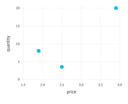
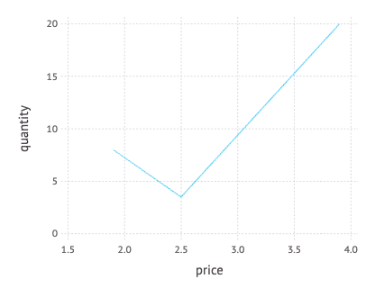
First we want to see how the quantities are distributed by price. Depending on the geometry chosen, we get either a scatter plot or a line diagram:
-
Map price to the x-axis, quantity to the y-axis using a point geometry
In Gadfly:
plot(inventory, x = :price, y = :quantity, Geom.point)
-
Map price to the x-axis, quantity to the y-axis using a line geometry
In Gadfly:
plot(inventory, x = :price, y = :quantity, Geom.line)`
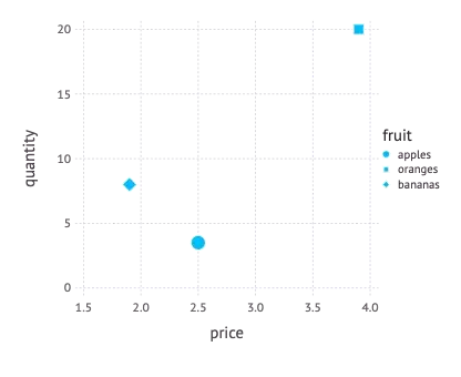
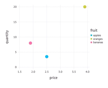
In the next step we want additionally see, which fruits are involved. So we have to map fruit to a suitable aesthetic too. In the following two examples first a shape is used and then a color.
-
Map price to the x-axis, quantity to the y-axis, fruit to a shape using a point geometry
In Gadfly:
plot(inventory, x = :price, y = :quantity, shape = :fruit, Geom.point)
-
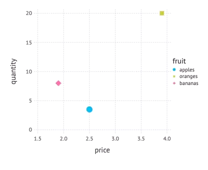
Map price to the x-axis, quantity to the y-axis, fruit to a color using a point geometry
In Gadfly:
plot(inventory, x = :price, y = :quantity, color = :fruit, Geom.point)`
It is also possible to map one variable to several aesthetics. We can e.g. map fruit to shape as well as color.
-
Map price to the x-axis, quantity to the y-axis, fruit to a shape, fruit to a color, using a point geometry
In Gadfly:
plot(inventory, x = :price, y = :quantity,`
shape = :fruit, color = :fruit, Geom.point)
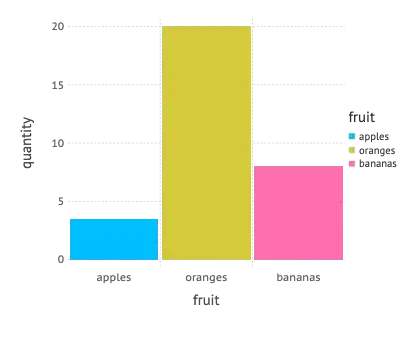
Using a bar geometry we can plot a statistics of the quantities in stock. Here we map a categorical variable (fruit) to positions on the x-axis.
-
Map fruit to the x-axis, quantity to the y-axis using a bar geometry
In Gadfly:
plot(inventory, x = :fruit, y = :quantity, Geom.bar)
These basic examples show nicely how a visualization can be specified using a few simple building blocks, thus making up a powerful visualization language.
They show also that these specifications enable a graphics package to derive meaningful defaults for a variety of aspects of a visualization which aren’t given explicitly.
All the examples had
- meaningful scales for the x- and y-axis (typically using a slightly larger interval than that of the data variable given)
- together with appropriate ticks and axis labeling
- as well as a descriptive label (simply using the variable name)
Some examples even had an automatically generated legend. This is possible because a legend is simply the inverse function of a data mapping to an aesthetic. If we e.g. map the variable fruit to a color, then the corresponding legend is the reverse mapping from color to fruit.
More ingredients
To be honest, we need a few more elements than just data, aesthetics and a geometry for a complete visualization.
Scale
In order to map numerical variables e.g. to positional aesthetics (like the positions on the x- or y-axis), we need also a scale which maps the data units to physical units (e.g. of the screen, a window or a web page).
In the examples above, a linear scale was used by default. But we could also exchange it e.g. with a logarithmic scale.
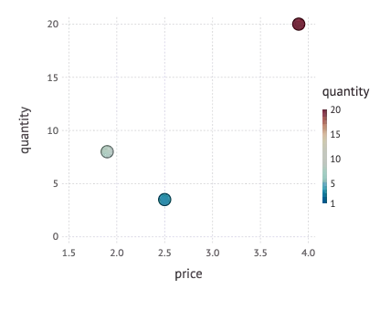
It’s also possible to map a numerical variable to a color. Then a continuous color scale is used for that mapping as we can see in the following example:
-
Map price to the x-axis, quantity to the y-axis, quantity to a color using a point geometry
In Gadfly:
plot(inventory, x = :price, y = :quantity, color = :quantity, Geom.point)
Coordinate system
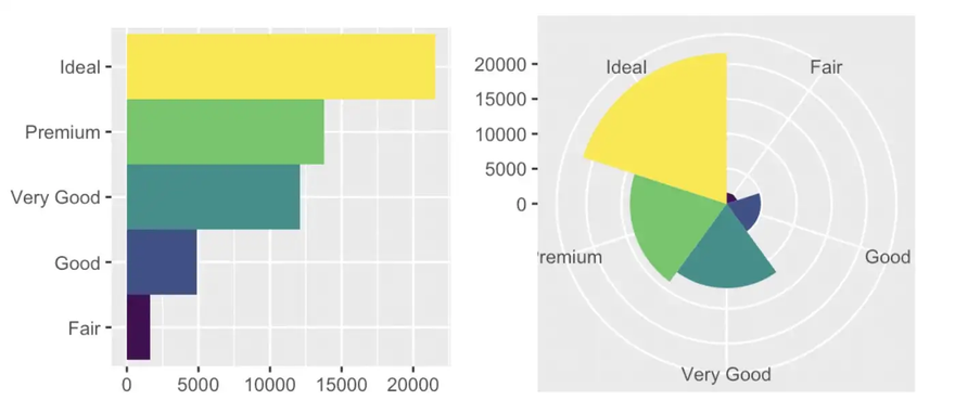
Closely related to a scale is the concept of a coordinate system, which defines how positional values are mapped onto the plotting plane. In the examples above, the Cartesian coordinate system has been used by default. Other possibilities are polar or barycentric coordinate systems or the various systems which are used for map projections.
It is an interesting aspect that we can produce different types of diagrams from the same data and aesthetics mappings, just by changing the coordinate system: E.g. a bar plot is based on the Cartesian coordinate system. If we replace that with a polar system, we get a Coxcomb chart, as the following example from R for Data Science (by Hadley Wickham and Garret Grolemund, O’Reilly, 2017) shows.
Conclusions
With these two additional concepts we have now a complete picture of the basic GoG. In this short article I could of course only present a subset of all possible aesthetics and graphics and there are more elements to the GoG like statistics and facets. But what we have seen so far is the core of the Grammar of Graphics and should be enough to grasp the main ideas.
Comparison of Julia graphics packages
Let’s now switch to the comparison of different Julia graphics packages which I will present in several follow-up articles. As sort of a preparation I will now present the data used for different example plots (which are inspired by the YouTube tutorial Julia Analysis for Beginners from the channel julia for talented amateurs) within these follow-up articles and give an outlook on what sorts of diagrams I will use for the comparison.
Countries by GDP
The basis of the data used for the plotting examples is a list of all countries and their GDP and population size for the years 2018 and 2019. It’s from this Wikipedia-page (which got the data from a database of the IMF and the United Nations). The data is also available in CSV-format from my GitHub-repository.
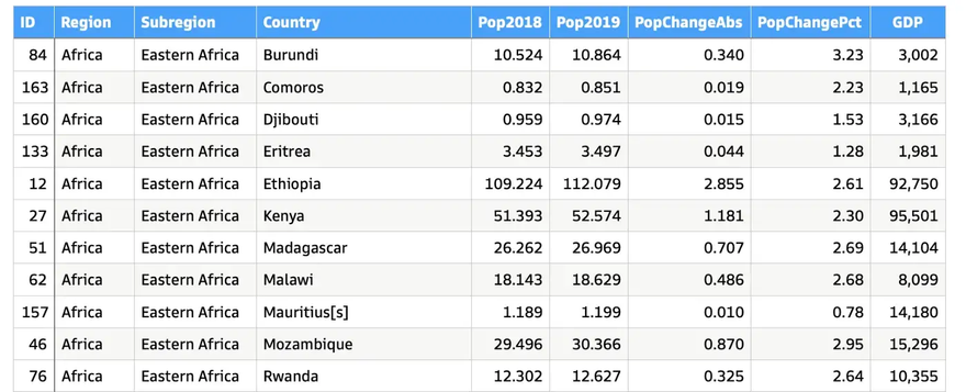
The columns of the list have the following meaning:
-
ID: unique identifier -
Region: the continent where the country is located -
Subregion: each continent is divided into several subregions -
Pop2018: population of the country in 2018 [million people] -
Pop2019: population of the country in 2019 [million people] -
PopChangeAbs: change in population from 2018 to 2019 in absolute numbers [million people] -
PopChangePct: likePopChangeAbsbut as a percentage [%] -
GDP: gross domestic product of the country in 2019 [million USD] -
GDPperCapita:GDPdivided by the number of people living in the country [USD/person]; this column is not in the source file, but will be computed (see below)
The file is downloaded and converted to a DataFrame using the following Julia code:
Line 7 computes the new column GDPperCapita mentioned above and adds it to the countries-DataFrame.
Aggregated data
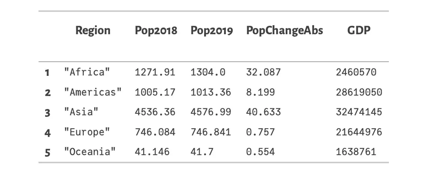
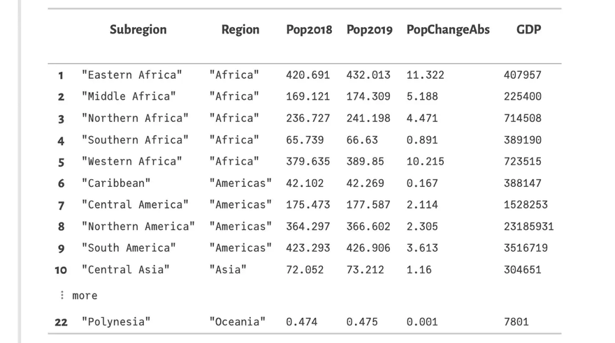
The detailed list which has one row per country (in 210 rows) will be grouped and aggregated on two levels (using DataFrame-functions):
Level 1 — Regions: The following code groups the list by Region (i.e. continent) omitting the columns Country and Subregion (using a nested select) in line 1 and then creates an aggregation summing up all numerical columns (lines 2–5).
Level 2 — Subregions: The same operations are applied on the subregion level in lines 7–11. First the countries are grouped by Subregion omitting column Country (line 7) and then an aggregation is created on that data; again summing up all numerical columns. Besides, the name of the region is picked from each subgroup (:Region => first)
This resulting DataFrames regions_cum and subregions_cum look as follows:
Summary
The DataFrames countries, subregions_cum and regions_cum are the basis for the plotting examples in the forthcoming articles about the different Julia graphics packages. In these articles we will see how to create
- bar plots
- scatter plots
- histograms
- box plots and violin plots
in each of these graphics packages.
The first article will present Gadfly. So stay tuned!
Top comments (0)