
This article appeared in Towards Data Science on Aug 25th, 2022
How to create statistical plots using the Gadfly.jl package
This is the first of several articles where I compare different Julia graphics packages for creating statistical plots. I start the series here with the Gadfly-package.
In the introduction to the series (The Grammar of Graphics or how to do ggplot-style plotting in Julia), I’ve explained the Grammar of Graphics (GoG) which is the conceptual base for these graphics packages. In that article I’ve also introduced the data which will be used for the plotting examples.
Gadfly
Gadfly is a very complete implementation of the Grammar of Graphics. Its original author is Daniel C. Jones, but the package has currently more than 100 contributors listed on GitHub. The first versions appeared in 2014. In the meantime it is a very mature package with only a few new releases per year.
It’s completely written in Julia and plays well with rest of the Julia ecosystem. There is e.g. a tight integration with DataFrames.jl and via the IJulia package it can be directly used within Jupyter notebooks.
For the rendering of publication quality graphics it’s able to render SVG out of the box and using Cairo.jl and Fontconfig.jl it can also produce formats like PNG, PDF, PS and PGF.
The plots produced by Gadfly offer some interactivity like panning, zooming and toggling.
Example Plots
For the comparison I will use a few diagram types (or geometries as they are called by the GoG) which are commonly used in data science, namely:
- bar plots
- scatter plots
- histograms
- box plots
- violin plots
Gadfly offers of course many types more as you can see in this gallery. But in order to obtain a 1:1-comparison between all packages, I stuck with the types listed above.
The data for the examples is assumed to be ready in the DataFrames structures countries, subregions_cum and regions_cum presented in the introducing article to the series.
Most plots are first presented in a basic version, using the defaults of the graphics package and get then refined using customized attributes (for labels, background color etc.).
Bar Plots
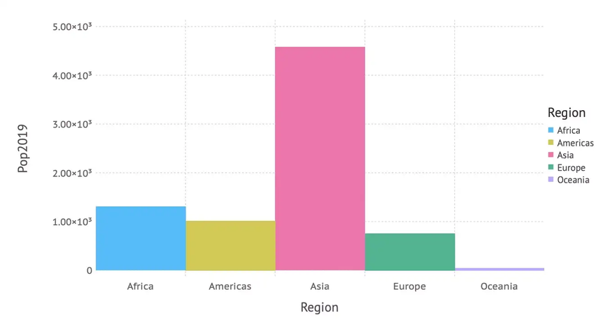
Population by Region
We start with a simple bar chart, that shows population size (in 2019) by region. This is done using the following plot-command mapping data to aesthetics and using a bar-geometry as we learned in the introducing article about the Grammar of Graphics:
plot(regions_cum,
        x = :Region, y = :Pop2019, color = :Region,
        Geom.bar)
… resulting in the following bar chart:
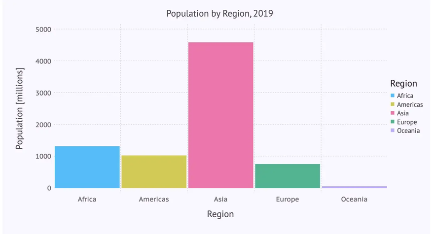
In a second version we don’t rely on defaults, but set axis labels, title and background color manually. Apart from that we don’t want the numbers on the y-axis in scientific format and there should be some space between the bars (to conform to the definition of a bar chart). This leads to the following code, where Guide-elements are used for the labels, a Scale for changing the numbers on the y-axis and a Theme for general attributes like background color or bar spacing.
… creating the following beautified bar chart:
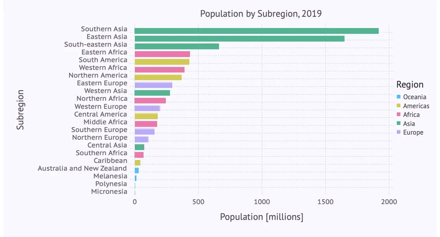
Population by Subregion
The next bar chart depicts population by subregion using the following plot-command:
plot(subregions_cum,
        x = :Subregion, y = :Pop2019, color = :Region,
        Geom.bar)
… resulting in the following bar chart:
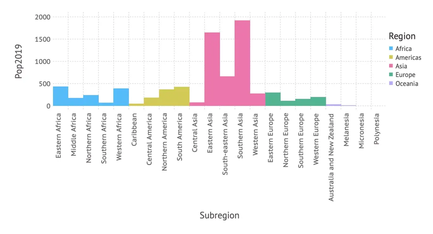
We can see that there is room for improvement: As there are quite a few subregions and their names a relatively long, a horizontal bar diagram might be more readable. Apart from this we adapt again labels, title, background color etc. leading to the following code, where we switch to a horizontal layout using the parameter orientation on the bar geometry:
… resulting indeed in a more readable bar chart:
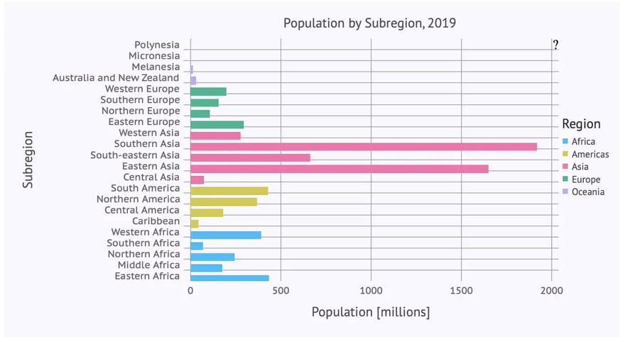
It gets even more readable, if we sort the subregions subregions_cum by population size (Pop2019) before rendering the diagram using the following command:
subregions_cum_sorted = sort(subregions_cum, :Pop2019)
If we apply the plot command from above to the sorted data subregions_cum_sorted we finally get:
Scatter Plots
In the next step we have a look at the population at the country level in relation to the growth rate. A scatter plot is good way to visualize this relationship. We get one using a point geometry as follows:
plot(countries,
        x = :Pop2019, y = :PopChangePct, color = :Region,
        Geom.point)
… resulting in this scatter plot:
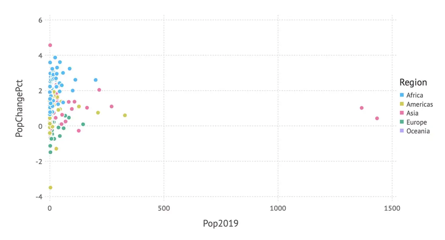
As we also mapped the region to the color aesthetics, we get a more differentiated picture involving region information in addition.
But the distribution of the data is quite skewed — most countries have a population below 200 Mio. So a logarithmic scale on the x-axis might give a better insight into the data. And again, we add some labels, background color etc. leading to the following code:
… giving us the following improved scatter plot:
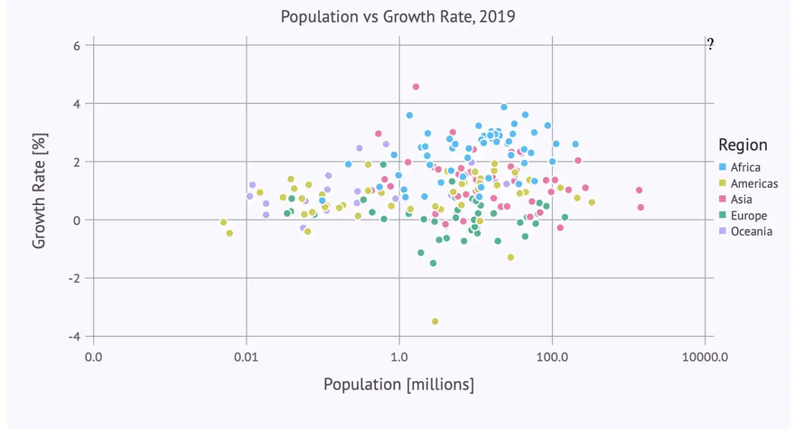
The labels-parameter for the log scale needs a bit of an explanation: Without this specification we would get the logarithms (to base 10) on the x-axis, which is for many people hard to understand. Instead we want just population numbers (e.g. 100.0 instead of 2). So we pass a function to labels which calculates the ‘correct’ labels. The log value x is converted to
to get a ‘readable’ number, then rounded to two digits and finally converted to a string (which is the expected type for a label).
Histograms
Bar plots and histograms have the same geometry (in the sense of the “Grammar of Graphics”). But in order to get categorical data on the x-axis the data used for a histogram has to be mapped to (artificial) categories in a process called ‘binning’. In the GoG this is done using a so-called bin statistic.
Gadfly doesn’t follow (or at least doesn’t show) the theory in this place. It introduces instead a separate geometry for histograms (which might be more practical for everyday use).
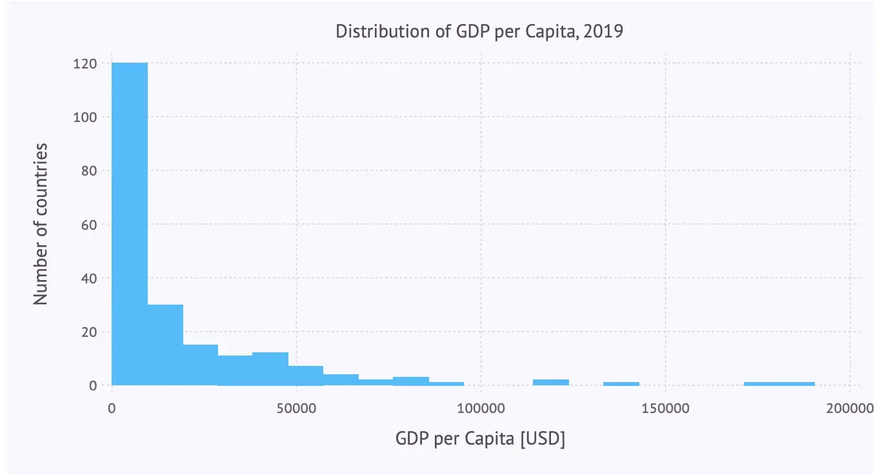
So we get a histogram that shows the distribution of GDP per capita among the different countries with the following plot-command using a histogram geometry:
plot(countries, x = :GDPperCapita, Geom.histogram)
… resulting in this histogram:
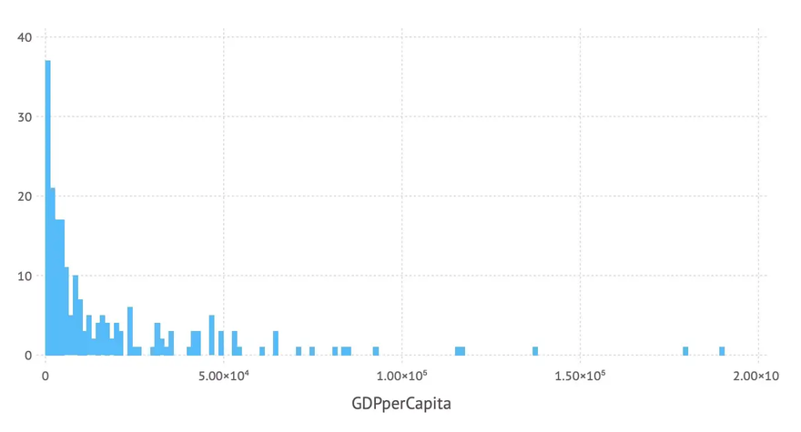
The number of bins used can be controlled by the bincount-parameter of the histogram geometry. And again we can add labels etc. resulting in the following code:
… leading to the following improved histogram:
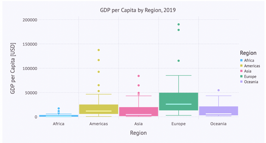
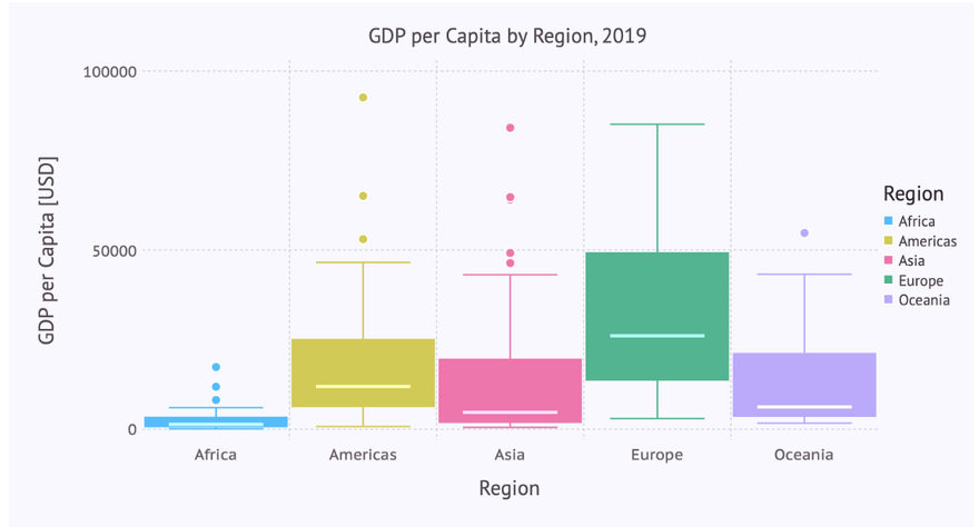
Box Plots and Violin Plots
To obtain an insight into the distribution of some numerical data, box plots or violin plots are typically used. Each of these diagram types has its specific virtues. So let’s visualize the distribution of the GDP per capita for each region using these plots.
Box Plot
Let’s immediately use the ‘beautified’ version using a boxplot-geometry:
… giving us the following box plot:
Violin Plot
The code for a violin plot for this visualization looks quite similar. The only difference being the use of a violin-geometry (instead of a boxplot):
… leading to the following violin plot:
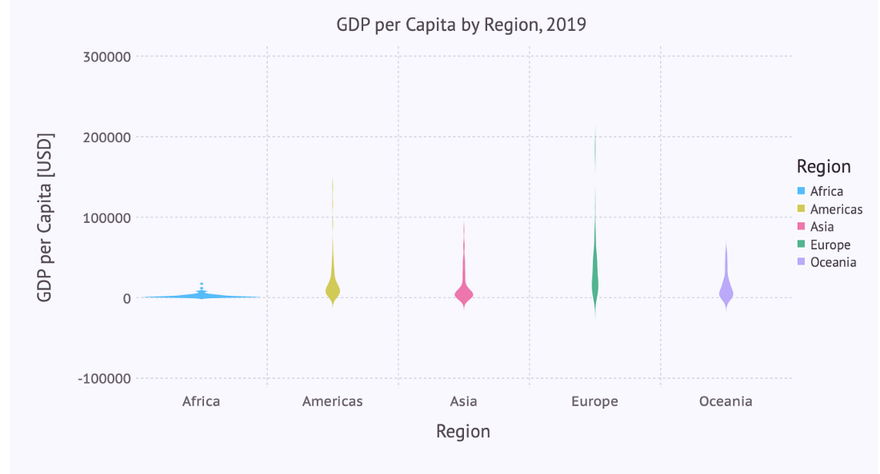
Here we note that the defaults for the scaling of the y-axis don’t work as good as with the box plot. Apart from that, the really interesting part of the distribution lies in the range from 0 to 100,000. Therefore we want to restrict the plot to that range on the y-axis, doing sort of a zoom-in.
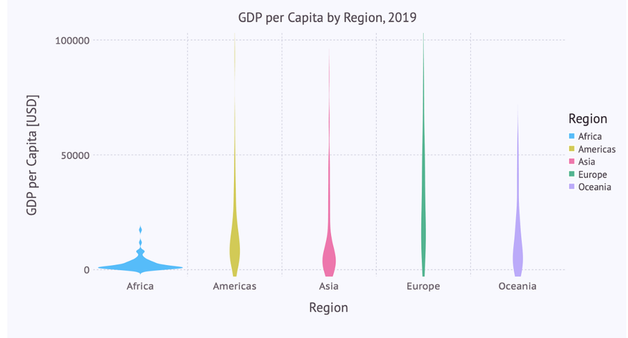
Zooming in
This can easily be achieved by adding the following line to the list of plot-parameters:
Coord.cartesian(ymin = 0, ymax = 100000),
… leading to the following violin diagram:
The same restriction to the y-axis can be applied to the box plot:
Conclusions
As we can see, Gadfly follows most of the time quite closely the concepts of the Grammar of Graphics. That’s one of the reasons why the plot specifications are so consistent (same things are always specified in the same way independent of context) und thus easy to learn and to memorize.
You reach only some limits when it comes to edge cases. E.g. if you specify a scatter plot where there is only a mapping to the x-axis but not to the y-axis. According to the GoG you should get points distributed on a line (the x-axis). That doesn’t work with Gadfly. And there is e.g. no polar coordinate system implemented (but could be done in the future).
But if your visualization needs are centered around the (large) list of geometries which are implemented in Gadfly and you don’t need rather exotic customizations of these diagrams then you will be quite happy with Gadfly.
If you want to try out the examples by yourself you can get a Pluto notebook which is sort of an executable variant of this article from my GitHub repository.
Oldest comments (0)