The purpose of this post is to show Julia as a language for data analysis and Machine Learning. Sadly Kaggle does not support Julia Kernels (hopefully, they will add it in the future). Therefore I wanted to take advantage of this space to show a reimplementation of Python/R Notebooks to Julia. In this context, I took data on happiness in countries in 2021 and some factors considered in this exciting survey.
Packages used
I'm using Julia version 1.8.0 in this project, and the library versions are in the Project.toml, there are some installed that I didn't end up using for this analysis, but these are the important ones
using DataFrames
using DataFramesMeta
using CSV
using Plots
using StatsPlots
using Statistics
using HypothesisTests
Plots.theme(:ggplot2)
Let's start reading the file.
df_2021 = DataFrame(CSV.File("./data/2021.csv", normalizenames=true))
You can see the dataset in the REPL.
julia> df_2021 = DataFrame(CSV.File("./data/2021.csv", normalizenames=true))
149×20 DataFrame
 Row │ Country_name    Regional_indicator            Ladder_score  Standard_error_of_ladder_score  upperwhi ⋯
     │ String31        String                        Float64       Float64                         Float64  ⋯
─────┼───────────────────────────────────────────────────────────────────────────────────────────────────────
   1 │ Finland         Western Europe                       7.842                           0.032         7 ⋯
   2 │ Denmark         Western Europe                       7.62                            0.035         7
   3 │ Switzerland     Western Europe                       7.571                           0.036         7
   4 │ Iceland         Western Europe                       7.554                           0.059         7
   5 │ Netherlands     Western Europe                       7.464                           0.027         7 ⋯
   6 │ Norway          Western Europe                       7.392                           0.035         7
   7 │ Sweden          Western Europe                       7.363                           0.036         7
   8 │ Luxembourg      Western Europe                       7.324                           0.037         7
   9 │ New Zealand     North America and ANZ                7.277                           0.04          7 ⋯
  10 │ Austria         Western Europe                       7.268                           0.036         7
  11 │ Australia       North America and ANZ                7.183                           0.041         7
  12 │ Israel          Middle East and North Africa         7.157                           0.034         7
  13 │ Germany         Western Europe                       7.155                           0.04          7 ⋯
  14 │ Canada          North America and ANZ                7.103                           0.042         7
  ⋮  │       ⋮                      ⋮                     ⋮                      ⋮                      ⋮   ⋱
 136 │ Togo            Sub-Saharan Africa                   4.107                           0.077         4
 137 │ Zambia          Sub-Saharan Africa                   4.073                           0.069         4
 138 │ Sierra Leone    Sub-Saharan Africa                   3.849                           0.077         4 ⋯
 139 │ India           South Asia                           3.819                           0.026         3
 140 │ Burundi         Sub-Saharan Africa                   3.775                           0.107         3
 141 │ Yemen           Middle East and North Africa         3.658                           0.07          3
 142 │ Tanzania        Sub-Saharan Africa                   3.623                           0.071         3 ⋯
 143 │ Haiti           Latin America and Caribbean          3.615                           0.173         3
 144 │ Malawi          Sub-Saharan Africa                   3.6                             0.092         3
 145 │ Lesotho         Sub-Saharan Africa                   3.512                           0.12          3
 146 │ Botswana        Sub-Saharan Africa                   3.467                           0.074         3 ⋯
 147 │ Rwanda          Sub-Saharan Africa                   3.415                           0.068         3
 148 │ Zimbabwe        Sub-Saharan Africa                   3.145                           0.058         3
 149 │ Afghanistan     South Asia                           2.523                           0.038         2
To see the columns name, simply use
names(df_2021)
getting a vector with all column names
julia> names(df_2021)
20-element Vector{String}:
 "Country_name"
 "Regional_indicator"
 "Ladder_score"
 "Standard_error_of_ladder_score"
 "upperwhisker"
 "lowerwhisker"
 "Logged_GDP_per_capita"
 "Social_support"
 "Healthy_life_expectancy"
 "Freedom_to_make_life_choices"
 "Generosity"
 "Perceptions_of_corruption"
 "Ladder_score_in_Dystopia"
 "Explained_by_Log_GDP_per_capita"
 "Explained_by_Social_support"
 "Explained_by_Healthy_life_expectancy"
 "Explained_by_Freedom_to_make_life_choices"
 "Explained_by_Generosity"
 "Explained_by_Perceptions_of_corruption"
 "Dystopia_residual"
To see what is a regional indicator, we can see how every country is grouped.
julia> unique(df_2021.Regional_indicator)
10-element Vector{String}:
 "Western Europe"
 "North America and ANZ"
 "Middle East and North Africa"
 "Latin America and Caribbean"
 "Central and Eastern Europe"
 "East Asia"
 "Southeast Asia"
 "Commonwealth of Independent States"
 "Sub-Saharan Africa"
 "South Asia"
Let's do a simple operation with the dataframe getting the number of countries by regional indicator and sorting those
sort(
    combine(groupby(df_2021, :Regional_indicator), nrow),
    :nrow
)
Getting this output
julia> sort(
           combine(groupby(df_2021, :Regional_indicator), nrow),
           :nrow
       )
10×2 DataFrame
 Row │ Regional_indicator                 nrow
     │ String                             Int64
─────┼──────────────────────────────────────────
   1 │ North America and ANZ                  4
   2 │ East Asia                              6
   3 │ South Asia                             7
   4 │ Southeast Asia                         9
   5 │ Commonwealth of Independent Stat…     12
   6 │ Middle East and North Africa          17
   7 │ Central and Eastern Europe            17
   8 │ Latin America and Caribbean           20
   9 │ Western Europe                        21
  10 │ Sub-Saharan Africa                    36
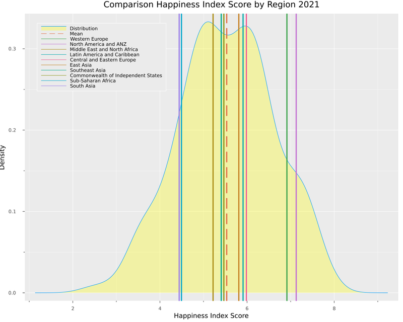
With this, we can see a more significant number of countries in Sub-Saharan Africa and only a smaller group of countries in North America and ANZ.
Now, let's try to slice our data. We will create a data frame called float_df that contains only the Float64 variables but excludes the "explained_" variables. This new dataframe will help us with some operations later.
#Get all columns Float64
float_df = select(df_2021, findall(col -> eltype(col) <: Float64, eachcol(df_2021)))

#Take away the Explained variables
float_df = float_df[:,Not(names(select(float_df, r"Explained")))]
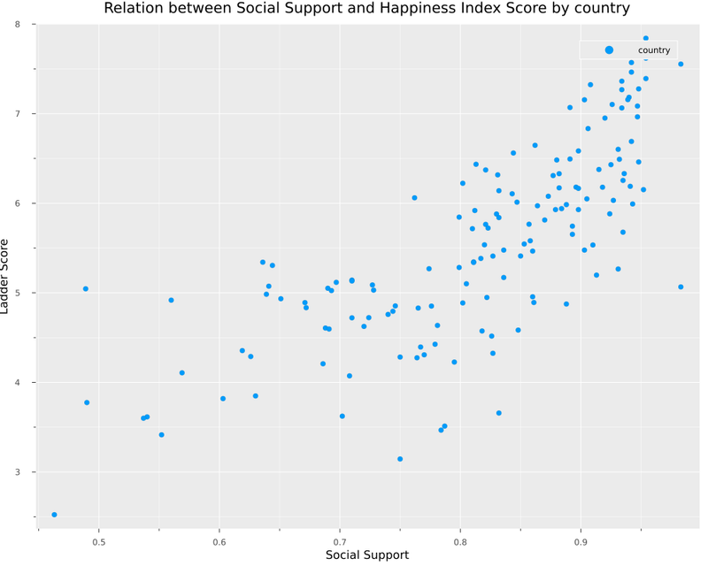
Let's make our first plot.
scatter(
    df_2021.Social_support,
    df_2021.Ladder_score,
    size = (1000,800),
    label="country",
    xaxis = "Social Support",
    yaxis = "Ladder Score",
    title = "Relation between Social Support and Happiness Index Score by country"
)
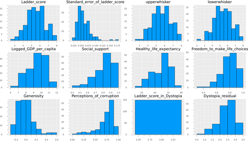
If we want a view of all float variables in several histograms, we can add this code using Statsplots.
N = ncol(float_df)
numerical_cols = Symbol.(names(float_df,Real))
@df float_df Plots.histogram(cols();
                             layout=N,
                             size=(1400,800),
                             title=permutedims(numerical_cols),
                             label = false)
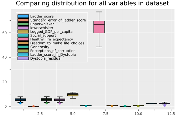
And If we want to compare it with boxplots.
@df float_df boxplot(cols(),
                     fillalpha=0.75,
                     linewidth=2,
                     title = "Comparing distribution for all variables in dataset",
                     legend = :topleft)
Without going into so much detail, we can affirm that the Ladder Score is the variable related to the result of the survey on the degree of happiness in the country (our dependent variable). Explained variables correspond to the preprocessing to build the Ladder Score, for this reason, we remove them from the dataframe and will hold with only the raw data.
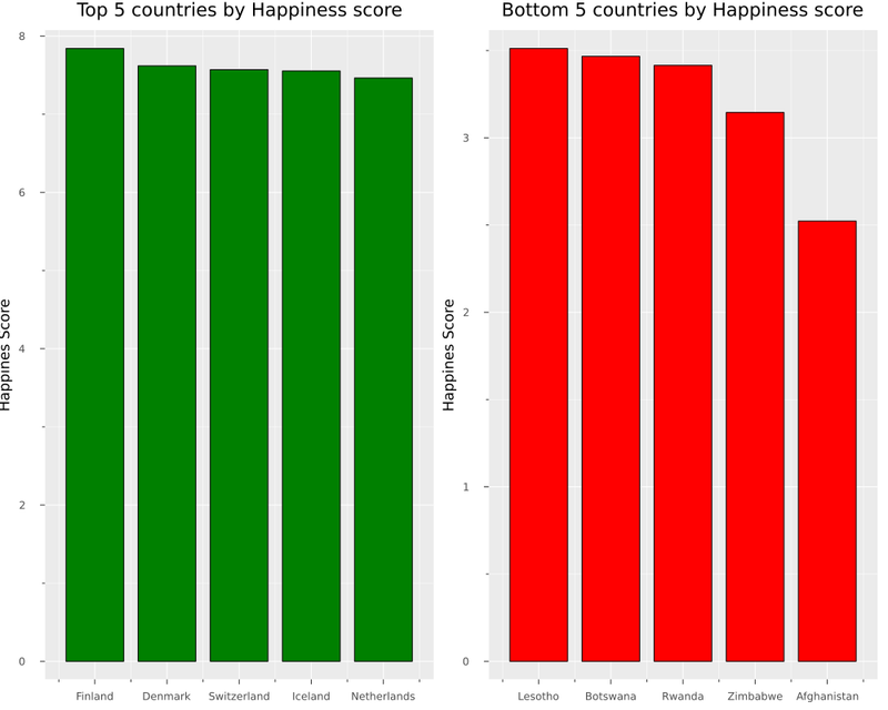
What are the top 5 countries and bottom 5?
# Top 5 and bottom 5 countries by ladder score
sort!(df_2021, :Ladder_score, rev=true)
plot(
    bar(
        first(df_2021.Country_name, 5 ),
        first(df_2021.Ladder_score, 5 ),
        color= "green",
        title = "Top 5 countries by Happiness score",
        legend = false,
    ),
    bar(
        last(df_2021.Country_name, 5 ),
        last(df_2021.Ladder_score, 5 ),
        color ="red",
        title = "Bottom 5 countries by Happiness score",
        legend = false,
    ),
size=(1000,800),
yaxis = "Happines Score",
)
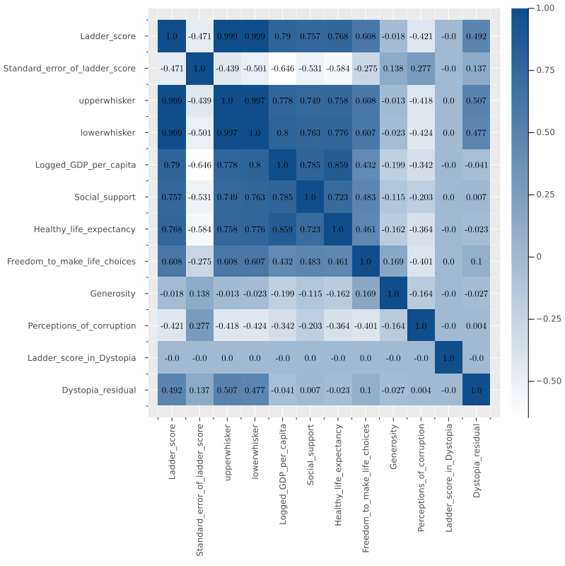
And the classic heatmap for correlation with the following function.
function heatmap_cor(df)
    cm = cor(Matrix(df))
    cols = Symbol.(names(df))

    (n,m) = size(cm)
    display(
    heatmap(cm,
        fc = cgrad([:white,:dodgerblue4]),
        xticks = (1:m,cols),
        xrot= 90,
        size= (800, 800),
        yticks = (1:m,cols),
        yflip=true))
    display(
    annotate!([(j, i, text(round(cm[i,j],digits=3),
                       8,"Computer Modern",:black))
           for i in 1:n for j in 1:m])
    )
end
And now, we can build a function where we can get the mean ladder score by regional indicator and compare it with the distribution of all countries.
function distribution_plot(df)
    display(
        @df df density(:Ladder_score,
        legend = :topleft, size=(1000,800) ,
        fill=(0, .3,:yellow),
        label="Distribution" ,
        xaxis="Happiness Index Score",
        yaxis ="Density",
        title ="Comparison Happiness Index Score by Region 2021")
    )
    display(
        plot!([mean(df_2021.Ladder_score)],
        seriestype="vline",
        line = (:dash),
        lw = 3,
        label="Mean")
    )
    for element in unique(df_2021.Regional_indicator)
        display(
            plot!(
            [mean(mean([filter(row->row["Regional_indicator"]==element, df).Ladder_score]))],
            seriestype="vline",
            lw = 3,
            label="$element")
        )
    end
end
Suppose we want to try the same idea but with countries. In that case, we can take advantage of multiple dispatch and create a function that receives a list of countries and creates a variation of the distribution with countries.
function distribution_plot(df, var_filter, list_elements)
    display(
        @df df density(:Ladder_score,
        legend = :topleft, size=(1000,800) ,
        fill=(0, .3,:yellow),
        label="Distribution" ,
        xaxis="Happiness Index Score",
        yaxis ="Density",
        title ="Happiness index score compare by countries 2021")
    )
    display(
        plot!([mean(df_2021.Ladder_score)],
        seriestype="vline",
        line = (:dash),
        lw = 3,
        label="Mean")
    )
    for element in list_elements
        display(
            plot!(
            mean([filter(row->row[var_filter]==element, df).Ladder_score]),
            seriestype="vline",
            lw = 3,
            label="$element")
        )
    end
end
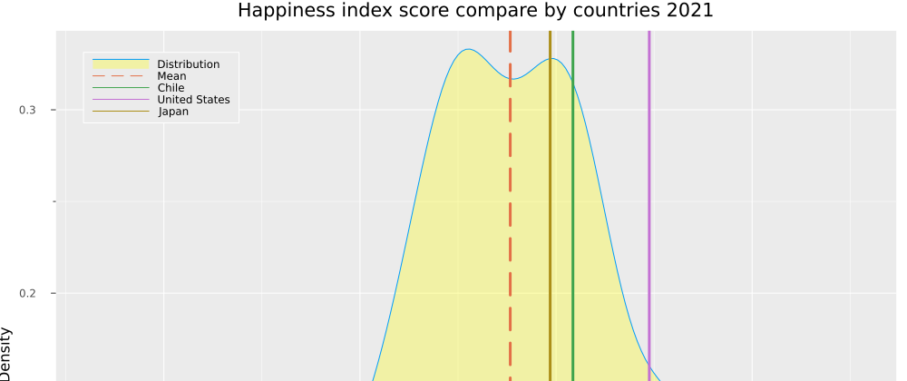
Let's test our new function, comparing three countries.
distribution_plot(df_2021, "Country_name", ["Chile",
                                            "United States",
                                            "Japan",
                                           ])
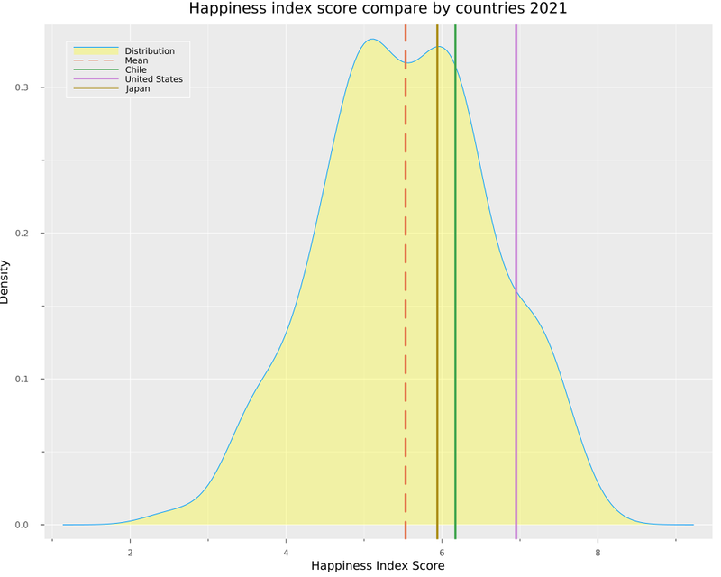
Here we can see how the USA has the highest score, followed by Chile and Japan.
To end the first part, let's apply some statistical tests. We will use an equal variance T-test to compare distribution from different regions. The function is as follows.
# Perform a simple test to compare distributions
# This function performs a two-sample t-test of the null hypothesis that s1 and s2
# come from distributions with equal means and variances
# against the alternative hypothesis that the distributions have different means
# but equal variances.
function t_test_sample(df, var, x , y)
    x = filter(row ->row[var] == x, df).Ladder_score
    y = filter(row ->row[var] == y, df).Ladder_score
    EqualVarianceTTest(vec(x), vec(y))
end
We will have this output if we compare Western Europe and North America and ANZ.
t_test_sample(df_2021, "Regional_indicator", "Western Europe", "North America and ANZ")
julia> t_test_sample(df_2021, "Regional_indicator", "Western Europe", "North America and ANZ")
Two sample t-test (equal variance)
----------------------------------
Population details:
    parameter of interest:   Mean difference
    value under h_0:         0
    point estimate:          -0.213595
    95% confidence interval: (-0.9068, 0.4796)

Test summary:
    outcome with 95% confidence: fail to reject h_0
    two-sided p-value:           0.5301

Details:
    number of observations:   [21,4]
    t-statistic:              -0.6374218416101513
    degrees of freedom:       23
    empirical standard error: 0.3350924366753546
We don't have enough evidence to reject the hypothesis that these samples come from distributions with equal means and variance. On another side, if we try comparing Western Europe with South Asia, we can see this:
julia> t_test_sample(df_2021, "Regional_indicator", "South Asia", "Western Europe")
Two sample t-test (equal variance)
----------------------------------
Population details:
    parameter of interest:   Mean difference
    value under h_0:         0
    point estimate:          -2.47305
    95% confidence interval: (-3.144, -1.802)

Test summary:
    outcome with 95% confidence: reject h_0
    two-sided p-value:           <1e-07

Details:
    number of observations:   [7,21]
    t-statistic:              -7.576776118465833
    degrees of freedom:       26
    empirical standard error: 0.32639840222022687
In this case, we can reject that hypothesis.
Clustering
Now we will cluster the countries using the popular algorithm Kmeans. My first option was to use clustering.jl. However, determining the ideal number of clusters is necessary to get the Wcss (within-cluster sum of the square). With this, we can evaluate it with the elbow method, so I used Scikit-learn wrapper. I also include an issue.
Well, let's continue with the last part. I started adding some libraries.
using Random
using ScikitLearn
using PyCall

@sk_import preprocessing: StandardScaler
@sk_import cluster: KMeans
Let's take out from the float_df all the variables related to Ladder_score, and keep only the variables considered in the survey.
select!(float_df, Not([:Standard_error_of_ladder_score,
                           :Ladder_score,
                           :Ladder_score_in_Dystopia,
                           :Dystopia_residual]))
To train our model, we need to standardize the data, and then we will create a list to retrieve the wcss in every iteration. The function is as follows:
function kmeans_train(df)
    X = fit_transform!(StandardScaler(), Matrix(df))

    wcss = []
    for n in 1:10

        Random.seed!(123)
        cluster =KMeans(n_clusters=n,
                        init = "k-means++",
                        max_iter = 20,
                        n_init = 10,
                        random_state = 0)
        cluster.fit(X)
        push!(wcss, cluster.inertia_)
    end
    return wcss
end
Let's invoke the function and plot the wcss.
wcss = kmeans_train(float_df)

plot(wcss, title = "wcss in each cluster",
    xaxis = "cluster",
   yaxis = "Wcss")
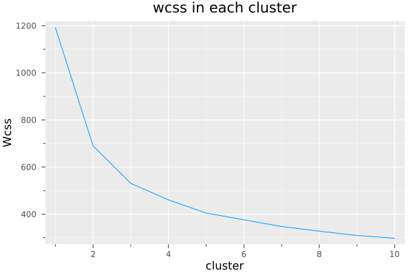
In this case, I decided to go for three clusters. We can abuse make use of multiple dispatch again, adding n for a defined number of clusters.
function kmeans_train(df, n)
    X = fit_transform!(StandardScaler(), Matrix(df))

    Random.seed!(123)
    cluster =KMeans(n_clusters=n,
                    init = "k-means++",
                    max_iter = 20,
                    n_init = 10,
                    random_state = 0)
    cluster.fit(X)
    return cluster
end

cluster= kmeans_train(float_df, 3)
If we take the first plot we did at the beginning of the post, but now we add the cluster labels, we have this plot.
scatter(df.Social_support,
        df.Ladder_score,
        marker_z = cluster.labels_,
        legend = false,
        size = (1000,800),
        xaxis = "Social Support",
        yaxis = "Ladder Score",
        title = "Comparison between social support and ladder score by country incorporating clustering")
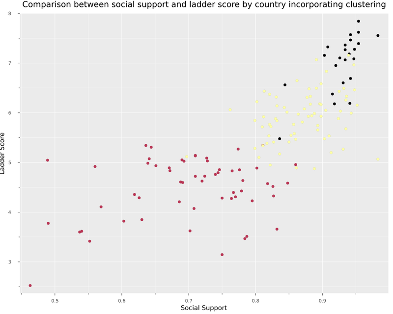
With these clusters, we have a group with developed countries with the highest happiness index score. For example, Finland, Australia and Germany, followed by a group of emerging countries. Finally, countries that still have a significant debt for the well-being of their population.
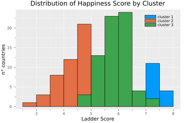
histogram(filter(row ->row.cluster ==1,df).Ladder_score, label = "cluster 1", title = "Distribution of Happiness Score by Cluster", xaxis = "Ladder Score", yaxis="n° countries")
histogram!(filter(row ->row.cluster ==2,df).Ladder_score, label = "cluster 2")
histogram!(filter(row ->row.cluster ==3,df).Ladder_score, label = "cluster 3")
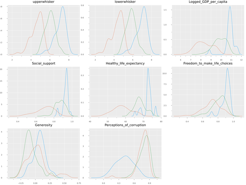
Finally, we can compare how this cluster affects all the variables.
@df float_df Plots.density(cols();
                             layout=N,
                             size=(1600,1200),
                             title=permutedims(numerical_cols),
                             group = df.cluster,
                             label = false)
Conclusions
From my experience using Python for about two years in data analysis and recently dabbling with Julia, I can say that the ecosystem generally seems quite mature for this purpose. I had some questions that the community immediately answered on Julia Discourse. More content like this is needed so that the data science community can more widely adopt this technology.

Top comments (4)
Since you're using DataFramesMeta anyway, you can write the
sortin the first part of the article (IMO more readably) as:And
float_dfcan be created as:Definitely looks more readable, thank you for your comment
This is an awesome post, I will make sure to share it with the community : )
Thank you Logan