Eh, still think that "State of Kaggle" is a better title
Recently, Kaggle published their annual "Machine Learning and Data Science Survey" data. Their stated objective is to:
conduct an industry-wide survey that presents a truly comprehensive view of the state of data science and machine learning.
More likely, its representative of active Kaggle members with the time and inclination to fill out a fairly long survey. Still I think it would be fun to explore this data and see how the Kaggle community shapes up. Plus, Kaggle (still) does not support Julia in its kernels so maybe this post with push them down that path. It certainly won't but one can hope.
The survey consisted of 43 questions containing both multiple choice question with only one selection allowed and multiple selection questions. It generated almost 24,000 responses, with each line representing the choices of an individual respondent. The dataset is available under a Creative Commons licence here.
I am going to use the DataFrames.jl and Gadfly.jl libraries for most of the analysis and plots in this plot. Would have used Makie.jl but my laptop has a love-hate relationship with Makie. Also, Gadfly's defaults look prettier. Let's bring in those and read in the dataset as a dataframe:
using CSV
using DataFrames
using Gadfly
using StatsBase
using Colors
using DataStructures
using ColorSchemes
dataset = CSV.read("kaggle_survey_2022_responses.csv", DataFrame, header=2)
# The first row is just the list of Questions from Q1 to Q47 and not particularly interesting
Let's quickly gain some idea of the shape and composition of the dataset.
size(dataset)
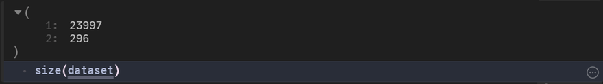
Interesting the dataset has 296 columns for 47 responses. The survey details say that , Responses to multiple selection questions
(multiple choices can be selected) were split into multiple columns (with one column per answer choice). Likely this is what caused those extra columns to appear in the dataset:
Demographic Information
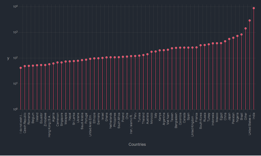
We will first look at the number of survey responsdents per country. I think I know which country will finish at top, but we'll see.
Next let's check out the distribution of age of the survey respondents.
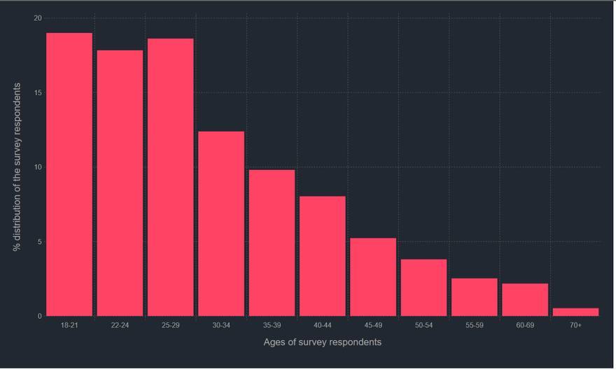
As you would expect the bulk of the respondents, almost 60% infact, are between 18–30s. Not particularly surprising given the respondents would be mostly Kaggle users themselves, though I suspect there's some disconnect here between the survey and actual industry trends. This is of course, just baseless speculation, so don't take it too seriously.
Let's just quickly split the same information by gender to see how it matches.
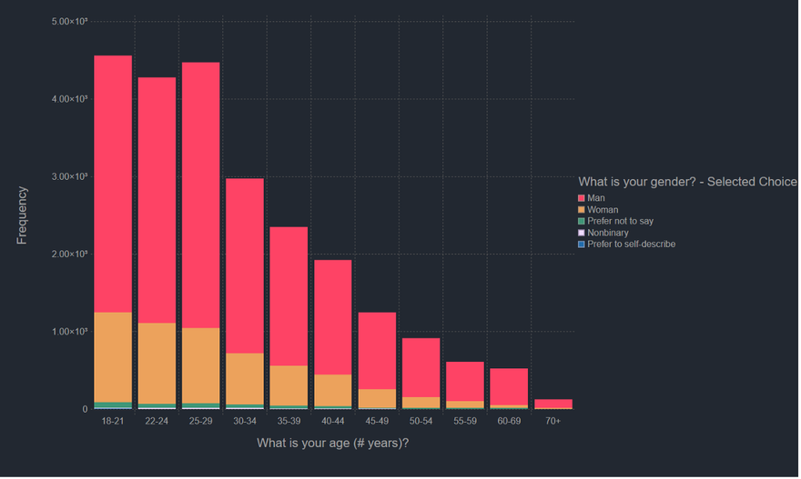
The trends in this graph accurately capture my own experience, i.e. my Data Science and AI teachers were overwhelmingly men, while my own colleagues and peers aren't.
While we are on the topic of experience and age groups lets take a look at the experience levels of the repondents. Interestingly there are two variables we can look at while checking experience. We have For how many years have you been writing code and/or programming? and For how many years have you used machine learning models? I am going to take in For how many years have you been writing code and/or programming? and not just specific ML experience as that question is a bit too specific to me, e.g. would a scientist who has been using Data Science tools for some-time, not fall under the 2nd question because they have never used a ML model? I don't know. Also, the next variable we are going to look at income will more strongly correlate with years of experience rather than just ML experience, I think.
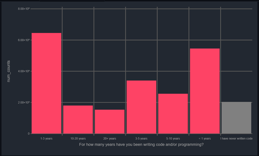
Pretty much as you would expect, data science is a fairly young field, Kaggle's audience even more so. Most of the respondents are between 0–5 years of experience in writing code. Now, let's talk about the money involved. This is actually really interesting. I am going to hypothesize that we'll find a clear divide between practioners in India and the USA, mostly due to dollar-to-rupee conversion rate.
We need some preprocessing so ensure that we can actually sort the incomes and ages. There's mulitple ways we could go about it, but my plan is to simply create a median value for both income and age columns.
Yes, I know, I know these functions don't build an actual median but its the intention which is the point.
I think a heatmap is a good choice here since we need to count a lot of categories. We can use the rectangular binning from Gafly, I think.
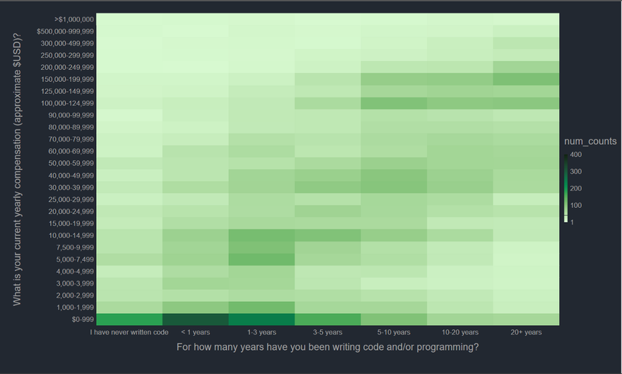
The graph is generally as you would expect, though the 0–999 is a bit too dark. Maybe the number of students in this particularly high, though that explanation still beggars belief. Let's see how the company size of the respondents affects the income level.
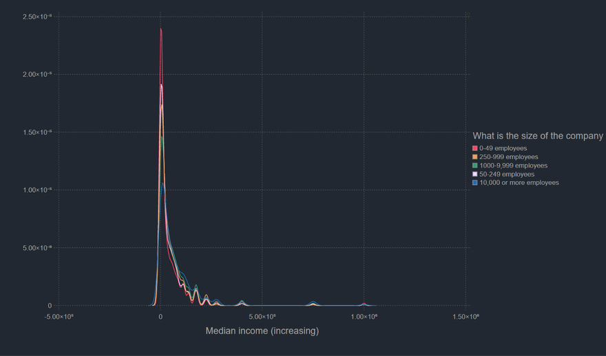
Nothing as such surpising here. The maximum number of respondents belong to 0–49 category and as you would expect aren't in the higher income brackets. They are essentially startups and most startups don't make too much money.
I think a question on income inequality is as good a place as any to end this post. I hope you enjoyed working though it and hopefully, be a bit more open to exploring Julia as an option in you own data science work. I should probably point out here that I am not a Julia expert, so likely most of this code can be optimized both, for speed and readability a lot more. If you have any ideas about it, do comment. Also if you wanna read a more prettier version of this blog post, check here.
If you want to chat with me you can reach here.

Latest comments (2)
Add to the discussion
Really nice analysis, I will write an article with other data analysis from Kaggle dataset soon